


Shizo by Shisiedo
Case Study
Branding
Writing
Strategy
Packaging
Art Direction
Photography
Editorial
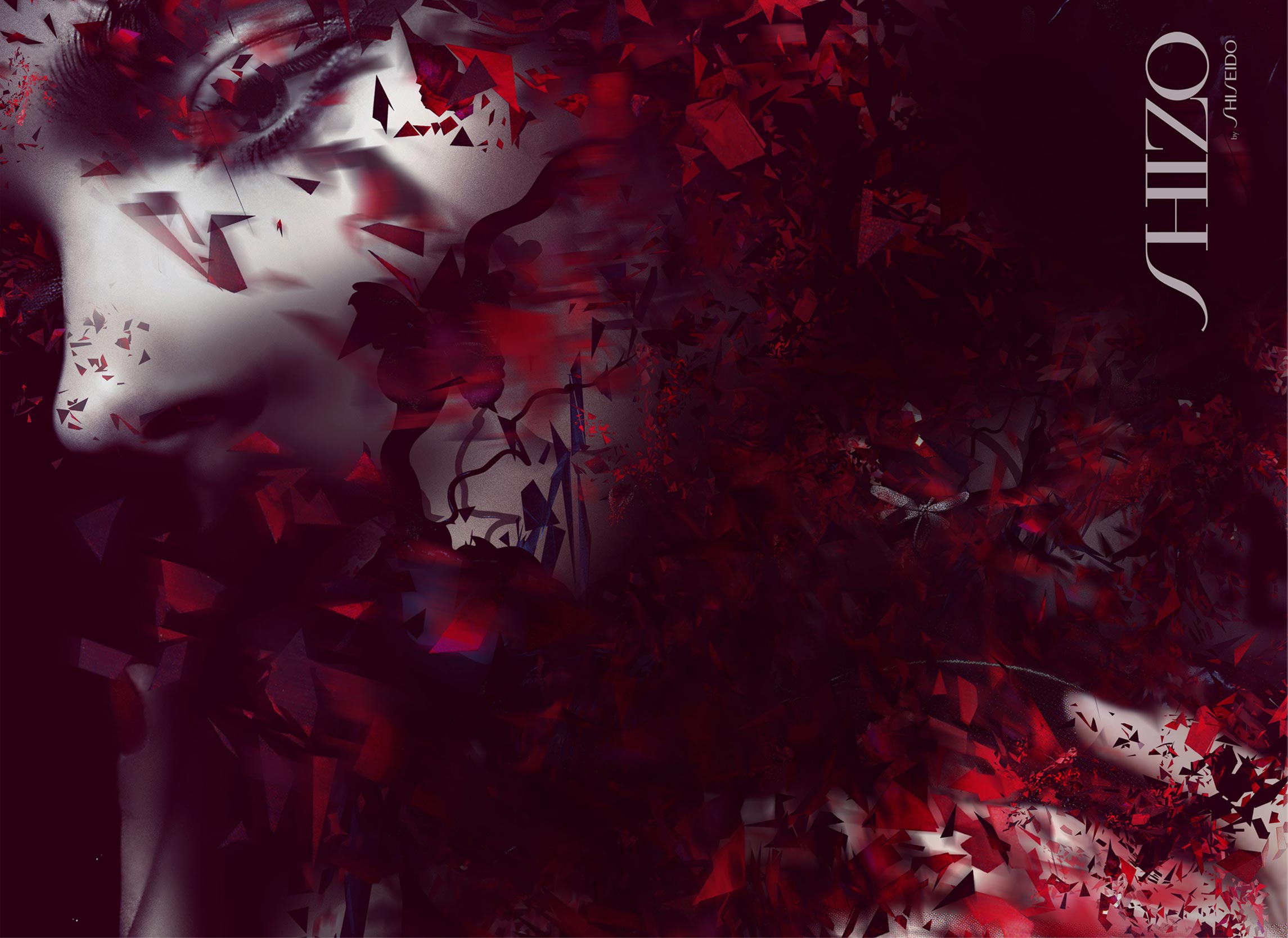
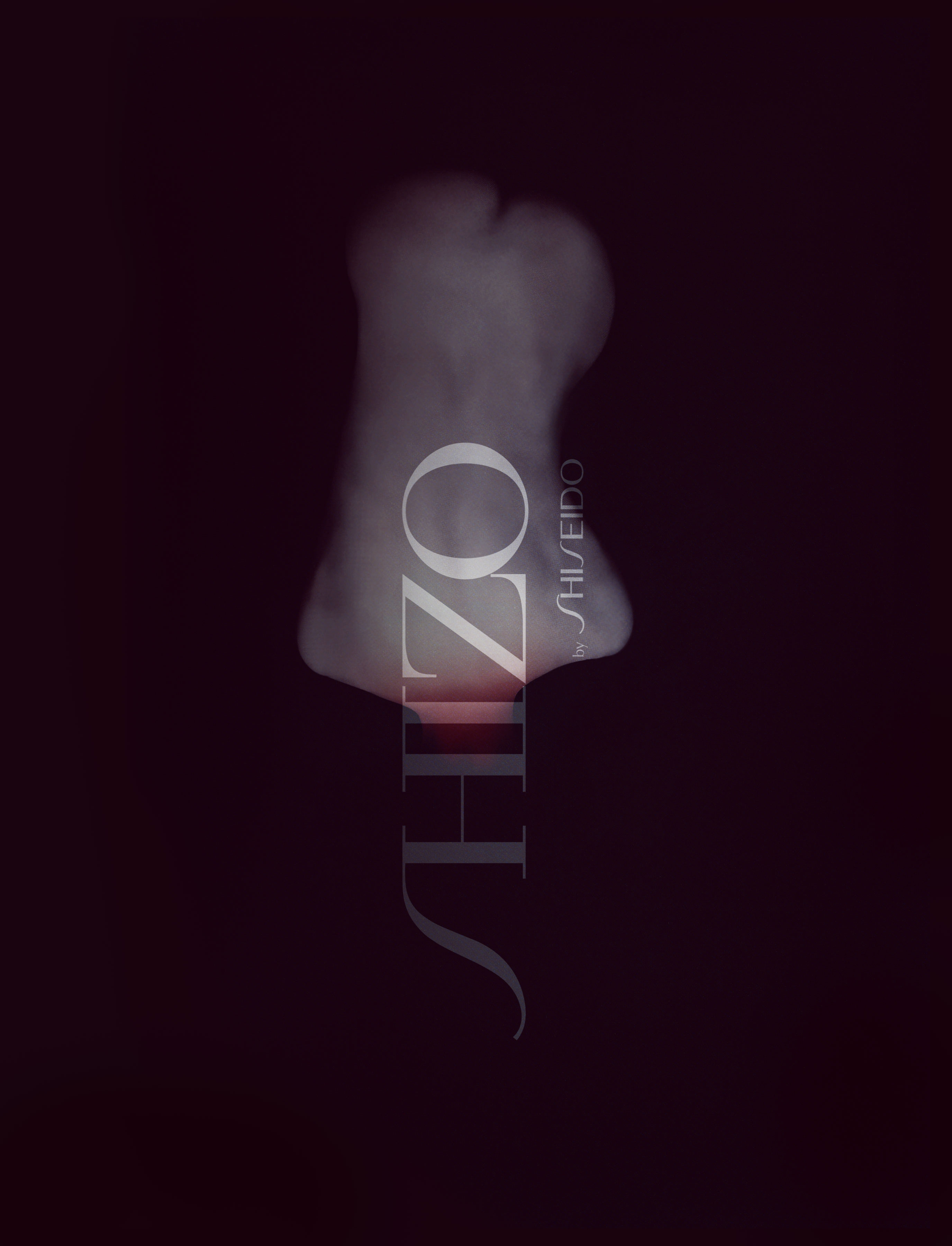
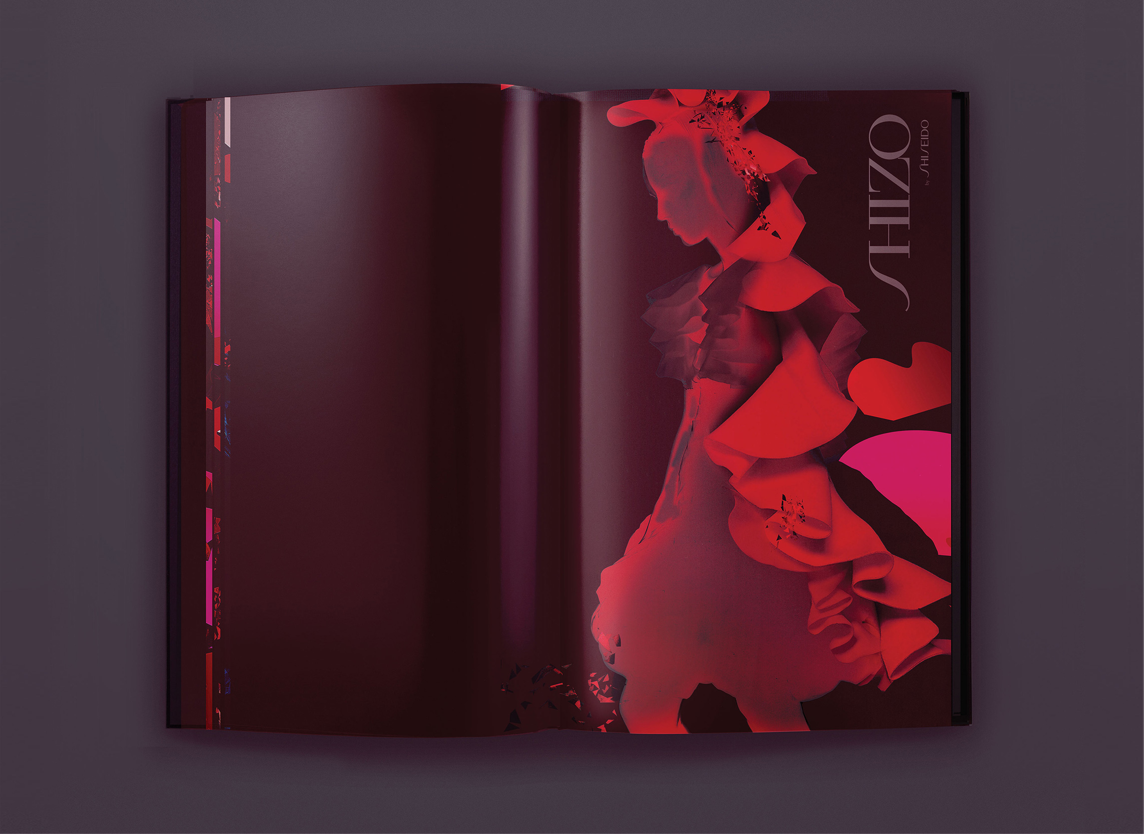
Shizo Re-Structured Beauty.
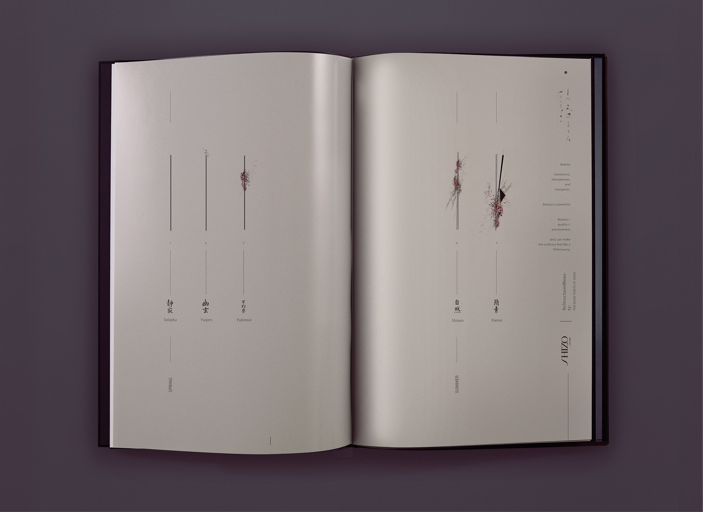
Beauty that transforms, transgresses, and transports.
Cosmetics provided one means for women to reinvent themselves, literally “making themselves up.” Shizo is a project which was first conceived as a graduate thesis and later funded by the Shiseido Group as special project. Shizo was born as a ‘pattern disrupt’ to the Shiseido brand and signaled a return to the traditional values in which the brand was founded upon: The fusion of art and technology within corporate culture.
Shizo creates product categories that have a direct relationship to the brand’s cultural values. Rather than SKU’s produced to fill a void in the retail marketplace, Shizo adopts these products into it’s DNA based on traditional Japanese ethics and aesthetics. All the art direction, literature, product development and ethics of the SKU’s fall out of 7 tenets of Japanese Beauty:
Kanso: simplicity— summer
Shizen: naturalness, absence of pretense— summer
Seijaku: quiet, calm, silent— spring
Yugen: suggestion not revelation— spring
Fukinsei: asymmetry— spring
Koko: austerity, bare essentials— fall
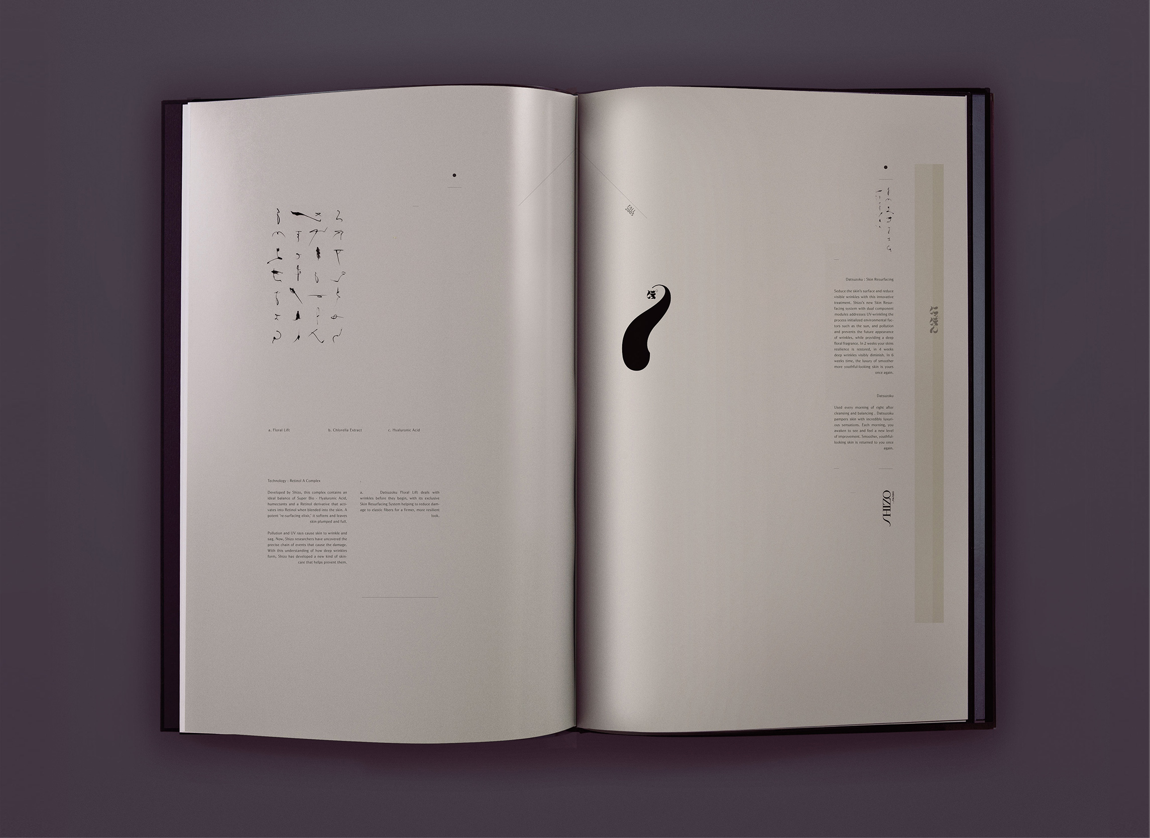
Datsuzoku: unworldliness, transcendence— fall
A Fall launch was produced for The Shiseido Group which included 2 products: Koko & Datsuzoku, the brand Identity and an image campaign in support of the two SKU’s.

Koko Packaging︎︎︎

Datsozuko Packaging & Imagery︎︎︎
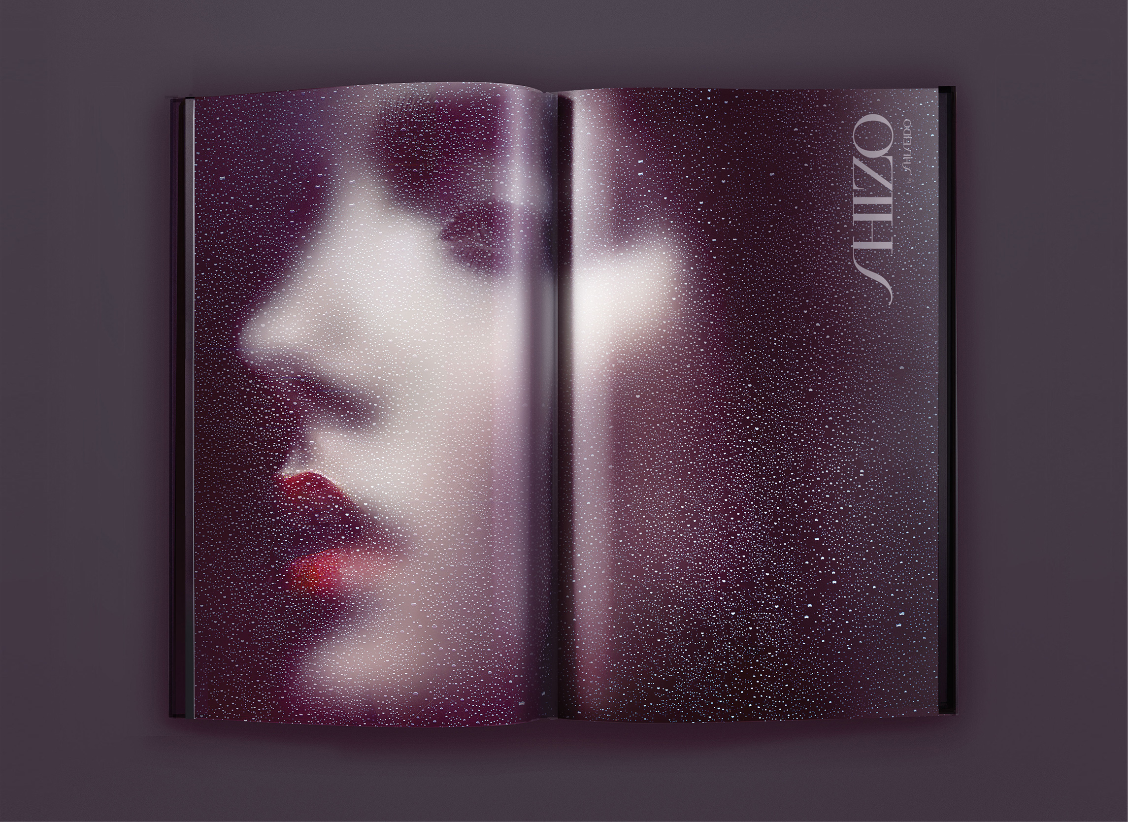


Shizo Brand Book & Imagery︎︎︎


